· Branding · 3 min read
Branding a small business in Doha: what you actually need before you spend on ads
A common pattern with new Doha businesses: a logo gets made quickly, sometimes for free through a friend or a marketplace freelancer, and the rest of the budget goes straight into Instagram ads. The ads run, the click-through looks fine, and the conversion rate is poor — because what the ad promises and what the brand delivers when someone lands on the page or walks into the shop don't match.
Branding isn't the logo. It's the set of decisions that make a business recognisable and trustworthy before anyone reads a word of copy. Here's what actually needs to exist before ad spend starts doing useful work.
A name and identity that survives translation
Doha is a bilingual market by default. A name or tagline that works in English but reads awkwardly, means something unintended, or simply doesn't transliterate cleanly into Arabic is a real cost — not a minor detail. This needs checking before a logo is finalised, not after signage is printed.
A logo that works small and in one colour
A logo that only looks right at business-card size, in full colour, on a white background, will fail the moment it needs to go on a delivery bag, a WhatsApp profile picture, or a black-and-white invoice. Test any proposed logo at 40 pixels wide and in solid black — if it falls apart, it isn't finished.
A colour and type system, not just a palette
"Brand colours" without rules for how they're used produces inconsistency: one social post in navy, the next in a slightly different blue because nobody has the exact hex code, a third design using a completely different font because the person making it didn't have brand guidelines to hand. A basic system — two or three colours, one heading font, one body font, and clear usage rules — costs little to define and prevents this from the start.
Application to the formats you'll actually use
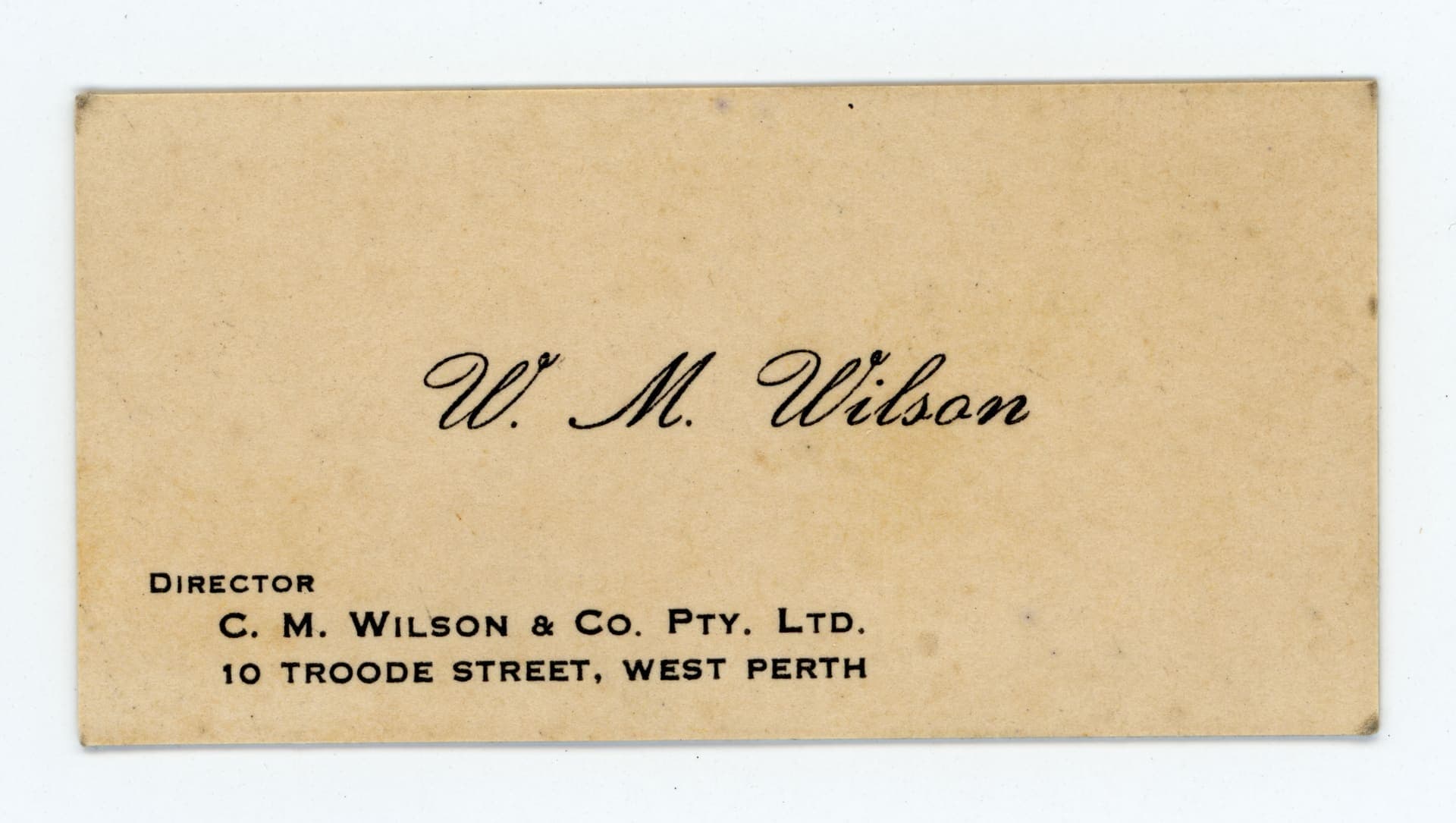
Most small businesses need some combination of: a shop sign, a menu or price list, business cards, a social media template, and packaging or a delivery bag. Design the identity with these specific applications in mind, not as an abstract exercise that gets awkwardly retrofitted to each one later.
Why this has to come before ad spend
An ad's job is to get someone's attention for two seconds and make them curious enough to click. What happens after the click — the landing page, the Instagram grid, the physical shop — is what converts that curiosity into a customer. If those don't look considered, the ad has done its job and the brand has wasted the opportunity it created.
Ads buy attention. Branding is what that attention finds when it arrives — and it decides whether the click was worth paying for.
This is also why campaign performance often looks disappointing for young businesses even when targeting and budget are reasonable: the ad isn't the problem, the destination is. Fixing the branding fundamentals first, even on a modest budget, usually improves ad performance more than increasing ad spend does.
What this costs, realistically
A focused identity project — name check, logo, a basic colour and type system, and templates for the two or three formats a business actually uses — is achievable well within a small business's first-year budget, and considerably cheaper than the ad spend it will make more effective. It doesn't need to be a full rebrand exercise; it needs to be complete enough that every piece of the business looks like it belongs to the same company.
See our branding and graphic design service for how we scope this, or get in touch before your next campaign goes live.
Written by
Blackpearl Studio Team